Measure QR Code Placement: Test, Size, and Track

Place QR codes at decision points, where people naturally pause and already hold a phone, and get two technical details right: size and quiet zone. A code at the checkout counter or on a table tent works because the reader has stopped moving. Before anything goes to print, we always recommend a scan test on the finished material.
TL;DR:
- Position QR codes at decision points where people pause, such as checkout counters, tables, or product in hand, rather than high-movement areas.
- Use the 10:1 heuristic for sizing; codes should be approximately one-tenth of the expected scanning distance, with a minimum of 2 by 2 centimeters for reliability.
- Ensure high contrast with a white background and avoid glossy finishes, maintaining a quiet zone free of graphics to improve scan success.
- Test finalized QR codes by scanning on-site with multiple devices, confirming contrast, size, quiet zone, and quick loading of the landing page.
- Use analytics to measure placement efficiency, and consider dynamic QR codes to update destinations without reprinting if initial placement underperforms.
Table of Contents
- Recommended placements and decision points
- Sizing rules: the 10:1 heuristic and absolute minimums
- Contrast, finish and the quiet zone
- Placement by use case: packaging, print, events and labelling
- Pre-print checklist and testing protocol
- How analytics and permanent codes change placement decisions
- Common user interaction patterns and their impact on placement efficacy
- Camera angles and scanning software limitations
- Environmental factors beyond lighting
- Best practices for digital versus physical placement
- A habit worth adopting
- Try QRlytics for placement that you can actually measure
- FAQ
- Sources
- Key standards and guidance to consult
Recommended placements and decision points
The best QR code placements share one trait: they sit where attention and intent meet. A busy sidewalk poster gets seen by thousands of people, but almost none of them stop walking. A table tent, a checkout counter or a waiting-room wall catches far fewer eyes, yet those eyes belong to people who have already paused.
Strong placement spots include:
- Checkout counters and till points, where customers stand still for several seconds.
- Waiting areas, such as reception desks, queue lines or seating zones.
- Eye-level posters positioned at roughly 1.5 to 1.7 metres from the floor.
- Menus and table tents, which combine a pause with a clear next action.
- Product fronts or side panels, visible when the item is already in hand.
High footfall is not the same as high intent. A code placed where people are moving fast, scrolling past, or distracted by a queue will underperform one placed where the environment itself invites a short pause.
Pro Tip: Position the code directly next to the call to action it supports, not elsewhere on the page, so the reader’s eye moves from instruction to code in one step.
Sizing rules: the 10:1 heuristic and absolute minimums
A useful planning rule is the 10:1 heuristic: the code’s width should be roughly one-tenth of the expected scanning distance. A code meant to be scanned from three metres away needs to be around 30 centimetres wide; one scanned from a 30 centimetre arm’s length only needs to be about 3 centimetres across.
Below a certain point, size stops being a design choice and becomes a reliability problem. Codes smaller than roughly 2 by 2 centimetres struggle to scan reliably on consumer phones, regardless of print quality. Treat that figure as an absolute floor, not a target.
Practical sizing guidance:
- Measure the real scanning distance on site before finalising artwork, not from a desk.
- Increase size when the code encodes a long URL or dense data, since denser codes need more module space to stay readable.
- Add a short, human-readable URL underneath the code as a fallback for anyone who cannot scan or would rather type.
That last point matters more than it looks. The US Department of Energy’s QR guidance recommends including descriptive text alongside every code, both as a usability aid and as a basic accessibility measure.
Contrast, finish and the quiet zone
Black modules on a white background remain the safest combination for scan reliability. Branded colours can work, but weak contrast between the code and its background is one of the most common reasons a scanner hesitates or fails outright, so check contrast before approving any coloured design.
Surface finish matters just as much as colour. Gloss, metallic or heavily textured stock creates glare and reflections that can confuse a phone camera into misreading the finder patterns. A matte finish, or a small protective frame around a glossy code, avoids most of these failures.
The quiet zone is the blank margin surrounding the code, typically four modules wide. Scanners use that empty space to locate the code’s edges, so no text, logo or background graphic should ever sit inside it, even when the surrounding layout looks tight.
Placement by use case: packaging, print, events and labelling
General placement rules only go so far. Each format carries its own constraints:
- Packaging and retail. When a 2D code sits alongside a linear barcode for point-of-sale scanning, GS1 guidance places the complete symbol and its quiet zone within a 50 millimetre radius of the barcode’s centre. Consumer engagement codes meant only for shoppers can sit elsewhere on the pack, but should be clearly labelled so staff and scanners do not confuse the two purposes.
- Printed marketing. Posters and flyers need height and distance planning: a poster read from two metres away needs a code around 20 centimetres wide, following the 10:1 rule above. Always pair the code with a short URL and a direct instruction, such as “scan for menu” rather than a bare code with no context.
- Events and hospitality. Registration desks, table tents and menus are natural pause points and can greatly benefit from using a party QR code guide for event hosts. Place codes at table height or eye level, matching the posture guests actually hold while seated or queuing, not the posture of someone walking past a banner.
- Product labelling. Choose a flat panel wherever possible, away from seams, folds or seals that could distort the printed modules. Test the final code on filled packaging, not a flat proof, since shrink wrap and curved surfaces behave differently once the product is inside.
Pre-print checklist and testing protocol
A short testing pass before full print runs catches almost every placement failure that would otherwise show up as a ruined batch of flyers or an unscannable product label.
- Print a sample on the final material and finish, not a laser proof or digital mock-up.
- Scan it with several different phone models, in the lighting conditions the code will actually face.
- Confirm the quiet zone is intact, contrast is strong, size meets the 10:1 guideline, and the landing page loads quickly on mobile.
- Check reachability for people using wheelchairs or standing at a counter, and keep the short URL visible as a backup.
This mirrors the testing approach our checklist for QR code printing walks through in more detail, including the reprint risks that skipping a test run tends to create.
Pro Tip: Keep a phone with an older camera and a phone with a newer one on hand for testing: scanning behaviour varies more between devices than most people expect.
How analytics and permanent codes change placement decisions
Guessing which placement works is unnecessary once scan data exists. Heat maps and scan-by-location analytics show exactly which spots generate engagement, so a flyer that underperforms a table tent becomes obvious within days rather than after an entire print run. Every code generated during an active subscription keeps working permanently, even after cancellation, so a placement test run today stays valid for future campaigns rather than expiring. Our free QR code generator makes it easy to create a test code, place it, and check real scan results before committing to a full print order.
Common user interaction patterns and their impact on placement efficacy
People tend to scan in one of a few predictable ways, and each pattern favours a different placement. Someone standing at a till scans downward and close, which rewards a code at roughly waist to chest height. Someone reading a poster from across a room scans from a distance, which demands a much larger code and a clear instruction visible before they even approach.
Eye-tracking research on reading patterns supports placing the code near the call to action rather than isolated elsewhere on the page, since attention naturally follows F- or Z-shaped paths across printed layouts. A code tucked into a corner that the eye never reaches performs far worse than one sitting directly beside the offer it unlocks.
Hesitation is another pattern worth designing around. Removing that moment of uncertainty, rather than assuming the code speaks for itself, tends to be the difference between a glance and a scan.
Repeat interaction also shapes placement choices differently from one-off interaction. A code on a restaurant table gets scanned by a new person every seating, so it needs to survive wear and stay legible after repeated contact, while a code on a one-time flyer only needs to survive a single scan.

Camera angles and scanning software limitations
Smartphone cameras read QR codes best when held roughly straight on, within about a 15 to 20-degree tilt from perpendicular. Beyond that angle, the geometric distortion can confuse the scanner’s ability to locate the three corner finder patterns, especially on codes already near the minimum size.
Placement height interacts directly with this constraint. A code mounted high on a wall forces anyone standing close to tilt their phone sharply upward, which combines a poor angle with awkward framing. Positioning codes at a height that matches natural holding posture, rather than at a height convenient for a designer’s layout, avoids this problem before it starts.
Scanning software itself varies. Native camera apps on recent phones handle QR codes well, but older devices or third-party scanning apps can be less forgiving of low contrast, small size or steep angles. Testing across a handful of phone models during the pre-print stage catches most of these gaps, since a code that scans instantly on one device can fail entirely on another with a less capable camera or slower autofocus.
Environmental factors beyond lighting
Lighting gets most of the attention, but several other environmental factors cause just as many failed scans. Curved surfaces, such as bottles, cans or cups, distort the printed modules enough that a code sized correctly on a flat proof can become unreadable once wrapped around a cylinder. Testing on the actual filled, shaped packaging rather than a flat printout catches this before a full production run ships.
Movement is another overlooked factor. A code on a moving vehicle, a spinning display stand or material that flaps in outdoor wind gives a phone camera’s autofocus very little time to lock on. Static placement, or a larger code that gives the scanner more margin for small movements, reduces failed attempts in these settings.
Weather and surface wear also matter for anything placed outdoors or handled repeatedly. Rain, condensation and sun fading can degrade contrast over weeks, while a code printed on a paper table tent that gets picked up repeatedly will show creases and smudges that eventually interfere with scanning. Choosing a durable, matte-laminated material for high-handling locations avoids most of this gradual decline.
Best practices for digital versus physical placement
Physical placement is permanent once printed, which is exactly why the testing checklist above matters so much: a mistake on a poster or a product label costs a reprint, not just a missed click. Digital placement, by contrast, can be adjusted after launch, which changes the calculus for how much pre-launch testing is strictly necessary.
On a website or in an email, a QR code works best near the relevant content rather than isolated in a footer, and it should always include a standard clickable link alongside it, since anyone viewing on the same device they would scan with cannot use the code at all. Email in particular rewards restraint: one code tied to one clear action outperforms several competing codes on the same message.
In physical media, the fixed nature of print means every placement decision should assume no second chance until the next print run. This is where dynamic codes earn their keep: a code whose destination can be updated after printing lets a placement decision get corrected without reprinting the material itself, which is a meaningful advantage over a static code locked to one URL forever.

A habit worth adopting
The most common mistake we see is a code placed where it looks good on a mock-up but sits outside anyone’s natural reading path. The fix is simple: print a sample, scan it yourself, and check real performance from day one.
Try QRlytics for placement that you can actually measure
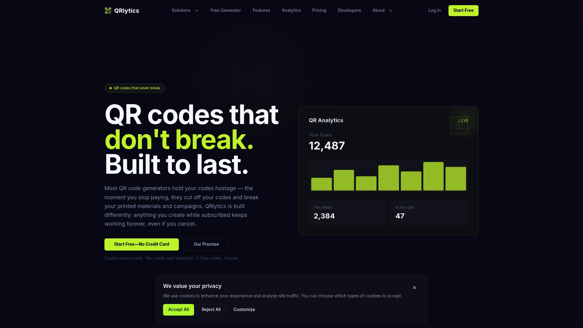
Placement decisions improve once they are measurable rather than guessed at. The platform is built so every code created during an active subscription keeps working permanently, even if billing lapses, which means a placement test today never turns into a broken poster months later.
- Generate a free test code with a QR code generator and try it in the actual location before a full print run.
- Track scans by location with real-time analytics and heat maps to see which placement earns its spot.
- Update the destination on a dynamic QR code without reprinting materials.
Compare plans, including our free tier, on the QRlytics pricing page when you are ready to scale a tested placement across a full campaign.
FAQ
Where is the best place to put a QR code?
The best placement is a decision point where someone has already paused, such as a checkout counter, a table tent or a product in hand. High foot traffic matters less than whether the viewer has stopped moving long enough to lift a phone.
When you use a QR code, where does it go?
Position the code directly beside the call to action it supports, at a height and distance that matches the 10:1 sizing rule for the expected viewing distance. Always leave the quiet zone, the blank border around the code, completely free of text or graphics.
Does it matter which way up a QR code is?
QR codes scan correctly at any rotation because their three corner finder patterns let a camera detect orientation automatically. Extreme tilt angles, rather than upside-down placement, are what actually cause scanning problems.
How is a QR code laid out?
A QR code consists of data modules surrounded by a quiet zone, with three corner finder patterns that let scanners detect position and rotation. Keeping that quiet zone clear and the modules at sufficient size and contrast is what makes the layout reliably scannable.