QR Code Accessibility for Developers: WCAG and Section 508 QA Steps

QR codes are accessible when three things happen together: a text alternative sits next to the code, the contrast and size meet recognised thresholds, and real assistive technology has tested the scan flow. Miss any one of these and you exclude users with low vision, motor limitations, or screen readers, regardless of how sharp the code looks on screen. The fixes are straightforward, but they need to be built in from the design brief, not patched on after printing.
TL;DR:
- Contrast should be at least 4.5:1 using luminance, not hue, to ensure QR codes are scannable by color-blind users and in unpredictable lighting.
- Mount QR codes around 100 to 120 centimeters high on stable, matte surfaces, avoiding glare, reflective finishes, or mounted on moving objects.
- Always include a short, visible URL next to the QR code and provide alternative access methods like typed URLs, NFC, or verbal instructions for users unable to scan.
- Treat QR codes as non-text content with meaningful alt text describing the destination, and ensure they sit within logical, keyboard-accessible interfaces.
- Use higher error correction levels like Q or H and test scans on multiple devices, including older models, under real-world lighting conditions before print deployment.
Table of Contents
- What is QR code accessibility, and why does it fail so often?
- Design and content best practices for accessible QR codes
- Where should you place a QR code so everyone can reach it?
- How do WCAG and Section 508 apply to QR codes?
- A testing checklist that catches accessibility failures early
- Make sure the destination itself is accessible
- Building accessibility into your operational checklist
- Consideration of colour blindness in QR code design
- Telling users how to interact with the code
- Accessibility metadata and ARIA labels for digital QR codes
- Alternatives for people who cannot scan at all
- Placement guidelines for lighting and glare
- Where to check the standards yourself
- Why accessible QR codes are an operational habit, not a checklist
- A permanent redirect fixes the accessibility risk most guides skip
- Sources
- FAQ
What is QR code accessibility, and why does it fail so often?
QR code accessibility means the code, its surroundings, and the destination it opens can all be used by someone with a visual, motor, or cognitive impairment, not just by a person with perfect eyesight and a steady hand. Most failures trace back to three categories of barrier.
Visual barriers show up when a code has low contrast between the modules and background, uses a heavily stylised or logo-embedded pattern, or gets printed too small for the scan distance. Motor and reach barriers affect wheelchair users, people with tremor, and anyone who cannot hold a phone steady while aiming at a code mounted awkwardly. Contextual barriers are the quiet killers: a code placed under glass that catches glare, a poster that flaps in the wind, a digital display that vanishes before someone can focus a camera, or simply no information nearby telling the user what scanning will do.
- Low contrast between code and background, or decorative overlays that break the scan pattern
- Codes printed too small for typical scan distances, or too large for the available quiet zone
- Codes mounted out of reach for wheelchair users or above comfortable eye level
- No visible label, short URL, or context explaining what the code leads to
- Glare, reflective laminate, or moving/ephemeral displays that prevent a stable scan
Design and content best practices for accessible QR codes
Contrast is where most codes go wrong, and colour is not the fix. Rely on luminance (lightness) contrast rather than hue, because roughly 1 in 12 men experience red-green colour blindness, and a code that only differentiates by colour will fail for a meaningful share of scanners. Section 508 guidance sets a minimum 3:1 non-text contrast ratio under WCAG’s SC 1.4.11, but treat that as a floor, not a target. A safer operating point for print, where lighting and surface finish are unpredictable, is 4.5:1 or higher.
- Set contrast first, colour second. Test dark modules on a light background (or vice versa) at 4.5:1 before you touch brand palettes.
- Size to the scan distance. A code read from arm’s length needs a larger quiet zone and bigger modules than one on a till receipt held six inches away. Avoid dense, artistic QR designs unless you can also print them large.
- Choose higher error correction. Levels Q or H cost you module density, meaning a slightly bigger code, but they tolerate scratches, glare, and shaky scans far better than level L.
- Write alt text about the destination, not the pattern. “Opens the accessible parking map” beats “black and white square pattern” every time.
- Print a short URL next to the code, always. It is the single highest-leverage accessibility addition you can make, and it doubles as a defence against sticker-overlay scams.
Pro Tip: If your code will be scanned by another device, such as a screen scanning a screen, keep it in light mode with dark modules. Reversed colour schemes trip up many older, budget phone cameras.
Where should you place a QR code so everyone can reach it?
Placement decides whether a technically perfect code ever gets scanned. A safe centre-of-code height sits around 100 to 120 centimetres, which keeps the code within forward-approach reach for most wheelchair users. Mounting anything above 140 centimetres routinely excludes seated users and shorter adults alike.
Surface choice matters as much as height. Avoid glass, laminate, or gloss finishes that catch overhead lighting, and never rely on a code printed on something that moves, such as a flag, a rotating display stand, or a screen that cycles content every few seconds.
- Mount codes on flat, matte vertical surfaces or stable counter displays, never on curved or reflective panels
- Keep the code within reach without requiring anyone to lean, stretch, or crouch
- At events and kiosks, station staff nearby who can assist or offer a printed alternative
- For low-motor-control users, consider an NFC tag alongside the code as a tap-to-open option
- Add tactile markers or verbal prompts where blind or low-vision users need to locate the code by touch, an approach field studies confirm improves scan success
How do WCAG and Section 508 apply to QR codes?
Treat every QR image as non-text content, the same category as a photograph or icon under WCAG. That classification carries two obligations. First, Section 508 and WCAG require a meaningful text alternative describing the code’s purpose or destination, not a description of the visual pattern itself. Second, SC 1.4.11 sets a minimum 3:1 contrast ratio between the modules and the background, which applies wherever the code is presented digitally or in print as part of an interface.
For digital displays, never build a flow that only works by scanning. A code embedded in a web page or app needs a real, clickable anchor link sitting next to it, reachable by keyboard and readable by a screen reader. Someone using a switch device, a screen reader, or simply browsing on a desktop with no camera attached must be able to reach the same destination without a phone camera at all. If your only route to a landing page is a scan, you have built a keyboard trap by another name, and broader accessibility strategy treats this exact pattern as an SEO liability too, since crawlers cannot scan a code either.
A testing checklist that catches accessibility failures early
Lab testing on a flagship phone under office lighting tells you almost nothing about how a code performs in the field. Test across a spread of devices, including at least one older or budget handset, since many struggle with reversed contrast schemes that flagship cameras handle without issue. Pair that with screen reader passes using VoiceOver on iOS and TalkBack on Android to confirm alt text reads sensibly and any adjacent link is reachable by keyboard or gesture navigation.
- Scan the code from the expected real-world distance and angle, not just square-on from a desk
- Test under the actual lighting the code will face: sunlight through glass, dim venue lighting, or fluorescent glare
- Run a screen reader pass to confirm the alt text and adjacent link both make sense out of context
- Confirm the printed short URL matches the landing domain exactly, which catches sticker-overlay attacks
- Provide fallbacks for anyone who cannot scan: a typed URL, an NFC tap point, or a staff member on hand
Pro Tip: Build a four-step pre-print QA pass: check quiet zone and module size at production scale, test scans from expected distances, scan with a budget phone, and verify the visible URL against the live domain.
Make sure the destination itself is accessible
An accessible code that lands on an inaccessible page has solved only half the problem. Build landing pages that are responsive, work cleanly with a screen reader, and use plain language rather than dense marketing copy, since a user who worked hard to reach the page deserves a fast, legible result.
Never auto-trigger a download, a video, or a purchase the instant the page loads. Give the user a clear, single call to action and, if your audience spans languages, an accessible language switcher rather than forcing a guess. Keep the URL short and visibly tied to your brand: a random string of characters invites suspicion, while a recognisable domain helps users spot phishing attempts before they tap anything.
Building accessibility into your operational checklist
Accessibility holds up only when it is written into the process, not left to individual designers to remember. Add contrast ratio, alt text wording, fallback URL, and an NFC decision to every creative brief before a code goes to print.
- Set a minimum 4.5:1 contrast requirement in the brief, with 3:1 as the absolute floor
- Require a written alt-text pattern describing destination, never appearance
- Mandate a visible short URL and mock up the signage under simulated venue lighting before approval
- Add a named accessibility sign-off step before any print run is authorised
Document these rules once in your organisation’s style guide, and platforms offering permanent redirect management and pre-print QA support make it far easier to update a destination without reprinting a single poster.
Consideration of colour blindness in QR code design
A notable share of men and a smaller share of women live with some form of colour vision deficiency, most commonly red-green. A QR code that relies on hue rather than lightness to stand out from its background will scan poorly for a real slice of your audience, and the scanner’s software cannot compensate for a design choice made at the print stage.
The fix is simple in principle and easy to get wrong in practice: always check luminance contrast, never colour contrast alone. A bright red code on a dark green background might look striking to someone with typical vision, but to a person with deuteranopia the two colours can appear nearly identical in brightness, collapsing the contrast the scanner needs to lock onto the pattern. Run your palette through a greyscale conversion before finalising it. If the modules and background still separate clearly once colour is stripped out, the design will hold up for colour-blind users too.
This matters as much for branded, colour-matched QR codes as it does for plain black-and-white ones. Marketing teams often want a code tinted to match a campaign palette, and that is fine, provided the lightness values of the two colours sit far enough apart. A dark navy code on a pale cream background will usually pass; a mid-tone orange on a mid-tone teal usually will not, no matter how well the colours photograph. When in doubt, default to standard black modules on a white background. It remains the single most reliable combination for colour-deficient users and for older camera sensors alike.
Telling users how to interact with the code
A code with no instructions asks the user to guess what happens next, and that guess excludes people who cannot see the code clearly enough to recognise it as a QR pattern at all. Every accessible implementation needs a short, plain-language cue sitting next to the code: what scanning it does, and what the user gets in return.
“Scan for the accessible seating map” tells a sighted user everything they need in five words. For a screen reader user who cannot see the code, that same phrase becomes the alt text, doing double duty as both the visual label and the non-visual description. Avoid vague prompts like “scan me” or a bare logo with no explanation, since they add friction for every user and outright exclude anyone relying on assistive technology to understand the page.
For physical signage, pair the instruction with a printed short URL as a typed alternative, so a person who cannot operate a camera confidently still has a route to the same destination. For blind or low-vision users navigating a physical space, a tactile marker or a nearby verbal announcement helps them locate the code at all before any scanning instruction becomes relevant, an approach that tactile graphics research shows measurably improves access for users unfamiliar with Braille. The instruction should always answer two questions at once: where is this, and what happens when I use it.
Accessibility metadata and ARIA labels for digital QR codes
When a QR code appears inside a web page, an app, or a digital sign rather than on a printed poster, it becomes an image element subject to the same markup rules as any other graphic. That means a genuine alt attribute describing the destination, not the visual appearance, and, where the code sits inside a more complex interactive component, an aria-label or aria-describedby attribute that gives screen readers the same context a sighted user gets from surrounding text.
Skip decorative-only markup like alt="" unless the code is genuinely redundant with an adjacent, fully accessible link, in which case marking it decorative is correct and avoids double-announcing the same destination to a screen reader user. Where the code is the only route to an action, the alt text needs to carry real weight: “Opens the digital loyalty card sign-up form” gives a screen reader user exactly what a sighted user infers instantly from context.
Developers building QR codes into single-page apps or dashboards should also confirm the code image sits within a logical tab order and that any surrounding container does not trap focus. A QR code rendered inside a modal, for instance, needs the modal itself to be dismissible by keyboard, and the code should never be the sole interactive element inside a component that otherwise ignores keyboard navigation entirely. None of this is exotic engineering. It is the same non-text content discipline WCAG applies to every other image on the page, applied consistently rather than skipped because “it’s just a QR code.”
Alternatives for people who cannot scan at all
Some users will never be able to scan a QR code, whether because they use a feature phone, have no camera access, face a motor impairment that makes aiming a lens impractical, or simply prefer not to. Accessible design treats the code as one route among several, never the only one.
The simplest fix is to make the QR code genuinely optional: keep a regular clickable link, a typed short URL, or printed text doing the same job, so the code is a convenience layered on top rather than a gatekeeper. For services where a phone call or email is a natural alternative, print the phone number and email address directly alongside the code, at a size that meets standard text accessibility guidance, so a user can act without touching a camera at all.
In staffed environments, such as events, retail counters, or reception desks, train staff to offer the underlying information verbally or on request rather than pointing silently at a poster. A member of staff who can say “the menu is also available as a large-print card” solves the access problem instantly, at effectively zero cost. For self-service kiosks, pairing a QR code with an NFC tap point serves users who struggle to hold a phone steady long enough to complete a scan, since a tap requires far less precision than framing a code in a viewfinder.

Placement guidelines for lighting and glare
Environmental conditions change a well-designed code’s real-world scan rate more than almost any other single factor, and they are the easiest thing to overlook in a design review conducted indoors under even lighting. A code mounted behind glass or laminate will catch reflections from overhead lights, shop windows, or direct sun, and that glare can defeat even a high-contrast, high-error-correction design.
Test signage mockups under the lighting conditions the code will actually face, not just studio lighting. Outdoor codes need matte finishes and, where possible, a mounting angle that avoids direct sun glare at peak hours. Codes near windows or under skylights should be checked at different times of day, since morning and afternoon sun can hit a single spot very differently.

Avoid mounting codes on any surface that moves, including flags, banners in wind, rotating retail displays, or screens that cycle content on a timer too short for a stable scan. A digital sign that shows the code for only a few seconds before switching to the next slide excludes anyone who scans more slowly, including users with motor impairments or those working with an older phone camera. If a digital display must rotate content, hold the QR code frame for at least ten to fifteen seconds, and repeat it periodically rather than showing it once and moving on. Where lighting genuinely cannot be controlled, such as an outdoor market stall, favour the highest error-correction level available and print the code larger than the minimum size guidance suggests, since real-world glare eats into your contrast margin in ways a lab test never reveals.
Where to check the standards yourself
Start with Section 508’s guidance on QR implementation for the compliance baseline, then read the Department of Energy’s standards page for placement and pre-print QA detail. Nielsen Norman Group’s usability guidelines cover real-world scanning behaviour, and Fast QR’s design breakdown is the most practical read on contrast and error correction.
Why accessible QR codes are an operational habit, not a checklist
Accessible QR codes save you from reprints, complaints, and quiet exclusion in equal measure. Every campaign I have seen fail on this did so because accessibility was reviewed after the design was locked, not before. Build the checks into the brief, not the post-mortem.
— The.
A permanent redirect fixes the accessibility risk most guides skip
Every fix in this guide assumes the code still points somewhere useful months after it was printed. Broken destinations are an accessibility failure too: a user who relies on a screen reader or a typed short URL gets nowhere if the link behind it has quietly gone dead. Qrlytics keeps codes created during an active subscription working permanently, even if billing lapses, so a reprint decision never gets forced by a code that simply stopped resolving.
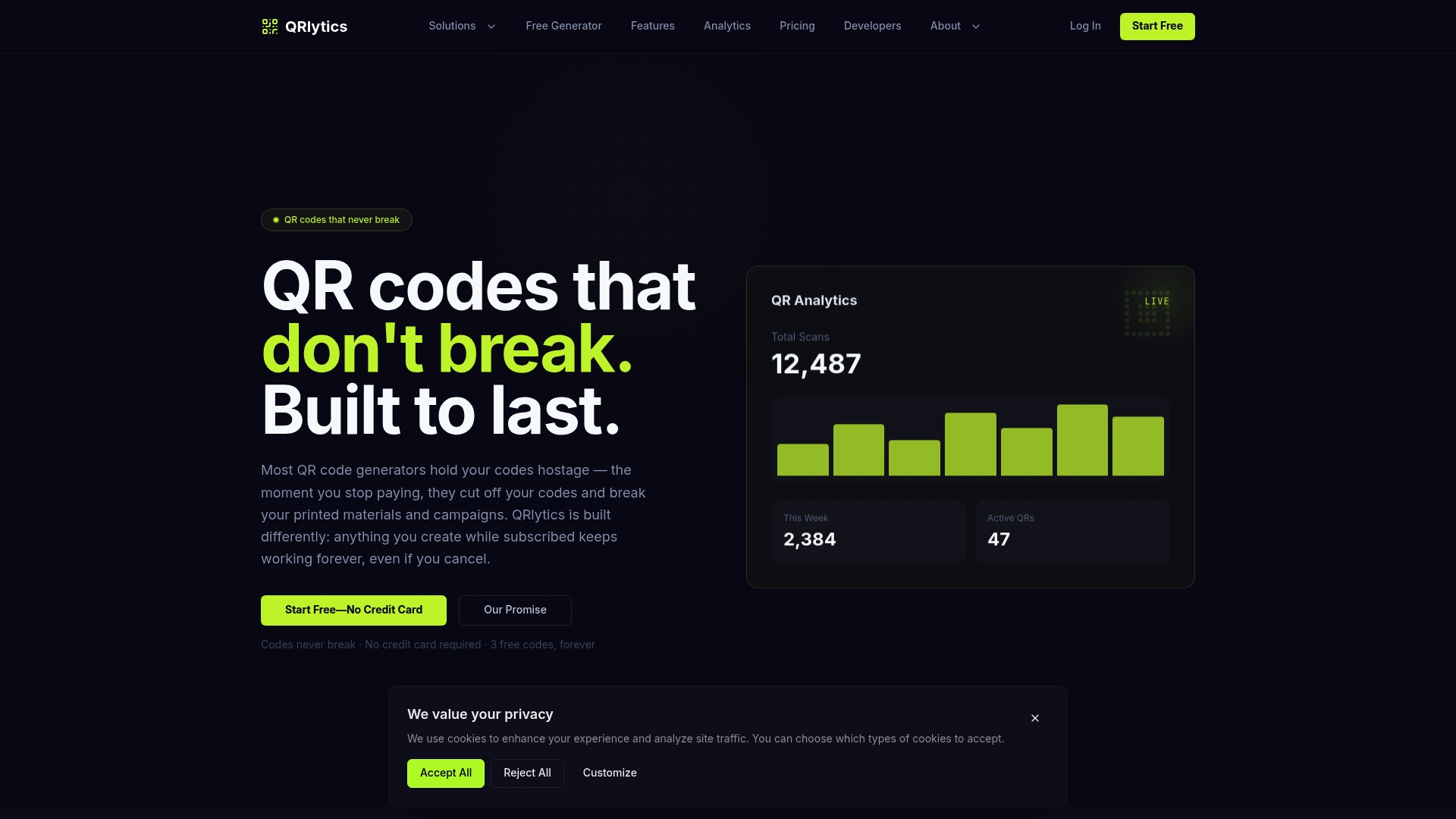
Beyond permanence, some QR code platforms provide short, brand-relevant URLs recommended for printing next to codes, along with real-time scan analytics to track reach gaps by device, region, or time of day. The free tier needs no credit card, so you can test contrast, sizing, and short-URL choices on a live code before committing a design to print. If you are managing dynamic destinations across a campaign, the dynamic QR code generator lets you update where a code points without touching the artwork at all. Start with a free code, run it through the testing checklist above, and see how the analytics read once real scans start coming in.
Sources
- Accessibility Bytes No. 8: Accessible QR Code Implementation
- 13 QR-Code usability guidelines
- QR Code Standards and Best Practices | Department of Energy
- Accessible QR Code Design for Low Vision, Color Blindness, and Motor Limits | Fast QR Blog
FAQ
Does a QR code need alt text if it already has a caption?
Yes, if the caption does not describe the destination or purpose, alt text is still required under Section 508 and WCAG’s non-text content rules. A caption reading “Scan me” does not meet that bar; alt text describing what scanning leads to does.
What contrast ratio should a QR code meet?
WCAG’s SC 1.4.11 sets a 3:1 minimum for non-text contrast, but a safer target for print and variable lighting is 4.5:1. Rely on luminance contrast rather than colour alone, since colour-blind users cannot depend on hue differences.
How high should a QR code be mounted for wheelchair users?
A safe centre-of-code height is around 100 to 120 centimetres, which keeps the code within forward reach for most wheelchair users. Avoid mounting above 140 centimetres.
What is the single best accessibility improvement for a printed QR code?
Print a visible short URL directly next to the code, giving anyone who cannot scan, or does not trust the code, a typed alternative. It also helps users verify they have not scanned a fraudulent sticker overlay.
Does Qrlytics support the short URLs this guide recommends?
Yes, Some QR code services generate short, brand-relevant redirect URLs alongside QR codes, and codes created during an active subscription may keep working permanently. Pricing details, including the free tier, are available on the Qrlytics pricing page.