How heat maps in QR analytics improve campaign results
![]()
TL;DR:
- Heat maps transform scan data into visual insights, revealing where engagement concentrates across locations. They enable marketers to identify hotspots, cold spots, and unexpected clusters, guiding targeted campaign adjustments. However, heat maps should be layered with conversion and contextual data to avoid misinterpretation and optimize campaign performance effectively.
Counting scans is the starting point of QR analytics, not the finish line. Most marketers stop at raw numbers, a total scan count here, a daily trend there, and assume they have enough to judge a campaign’s performance. What they miss is far more telling. Heat maps turn scan data into an at-a-glance view of where engagement concentrates, letting you spot patterns that a spreadsheet simply cannot reveal. This guide walks you through how heat maps work within QR analytics, how to interpret them correctly, and how to embed them into a workflow that genuinely improves campaign decisions.
Table of Contents
- What are heat maps and why do they matter in QR analytics?
- How heat maps reveal actionable engagement patterns
- The limits of heat maps: pitfalls and essential checks
- Integrating heat maps into your QR analytics workflow
- A marketer’s perspective: why heat maps alone aren’t enough
- Enhance your campaigns with advanced QR analytics and heat maps
- Frequently asked questions
Key Takeaways
| Point | Details |
|---|---|
| Visualise engagement fast | Heat maps display scan hotspots, letting you quickly spot which campaign elements perform best. |
| Segment for deeper insights | Break down data by location, device, and time to tailor your marketing strategies with precision. |
| Heat maps show patterns, not causes | Always pair heat map views with conversion data to avoid acting on misleading trends. |
| Validate before reacting | Use confidence checks to ensure findings are reliable before making changes to your campaigns. |
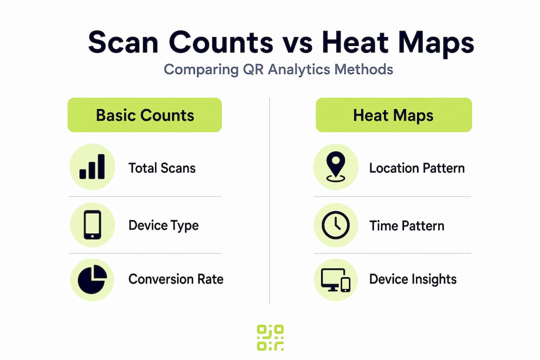
What are heat maps and why do they matter in QR analytics?
A heat map is a visual representation of data where colour intensity signals the strength of activity in a given area. In a geographic heat map, for example, darker or brighter zones indicate where scans cluster on a map, while cooler colours highlight regions with little engagement. That visual shorthand is enormously useful when you are managing campaigns across multiple locations, materials, or audience segments.
Standard scan counts tell you how many people engaged with a QR code. Heat maps tell you where that engagement is concentrated, and that distinction changes how you analyse and act on your data. Consider a retail chain running identical QR codes across thirty stores. A total scan figure of 4,000 per week sounds promising, but a heat map might immediately show that 3,200 of those scans come from just five city-centre locations, while the remaining twenty-five stores barely register. That insight takes seconds to read visually and might take hours to tease out from a raw data table.
QR codes with analytics are only as useful as the context they provide. Heat maps add that context quickly. Here is what they help you identify:
- Hotspots: Areas, time windows, or device categories where engagement is disproportionately high
- Cold spots: Zones with consistently low interaction, signalling poor placement, irrelevant audiences, or weak creative
- Unexpected clusters: Engagement in locations or at times you did not plan for, which can reveal untapped audiences
- Shifts over time: How engagement geography changes across campaign phases, giving you a dynamic rather than static picture
“Heat maps help marketers turn scan data into an at-a-glance view of where engagement concentrates, so you can identify ‘hot’ and ‘cold’ areas for action.” Qualtrics
The broader QR code guides community has increasingly recognised that moving beyond scan counts is not optional for serious campaign management. Heat maps are now considered a foundational analytics layer, not an advanced add-on.
How heat maps reveal actionable engagement patterns
Once you understand what heat maps visualise, the next step is extracting and applying their insights for real marketing impact. The key is to look at heat map data through more than one lens. Location is the most obvious dimension, but timing and device type add layers that can completely change your conclusions.
Location patterns help you optimise physical placement. If your QR code appears on outdoor signage, packaging, and point-of-sale materials, a heat map might show that packaging scans cluster in suburban postcodes while signage scans concentrate in city centres. Those are two different audiences with different behaviours, and you should be targeting them with different landing page content.

Time-based patterns show you when audiences are most receptive. A heat map built on hourly scan data might reveal a clear lunchtime peak from 12:00 to 13:30 and a secondary evening peak between 19:00 and 21:00. That information directly informs push notification timing, social media scheduling, and even when to prioritise paid media support for your QR-driven campaigns. Segmenting your QR analytics by time of day is one of the quickest ways to improve ROI without changing creative.
Device-based patterns are often overlooked. If heat map data shows Android dominance in one region and iOS dominance in another, your landing page experience should reflect that. iOS and Android users sometimes encounter different rendering on web pages, and if your destination page has not been tested across both ecosystems, you may be unknowingly degrading the experience for a significant portion of your audience.
Heat-map style reporting is particularly useful because it supports segmentation by location, device, and time, allowing you to optimise campaign outcomes well beyond what raw scan counts can offer.
Here is a simple comparison of what basic analytics versus heat map analytics gives you:
| Insight | Basic scan count | Heat map analytics |
|---|---|---|
| Total scans | Yes | Yes |
| Geographic distribution | No | Yes |
| Time-based concentration | Limited | Yes |
| Device-type breakdown | Sometimes | Yes |
| Visual hotspot identification | No | Yes |
| Cold spot detection | No | Yes |
Beyond the table, the real value is speed. A campaign manager reviewing a heat map at a Monday morning stand-up can redirect budget, update landing pages, or flag underperforming locations in minutes. That same review from raw data could take an analyst most of the morning.
Pro Tip: Layer your time-based heat map over your campaign schedule. If a hotspot appears before your ads go live in a region, it often signals organic interest worth nurturing with targeted follow-up.
You can also apply heat map thinking to packaging strategy insights when QR codes appear on physical products. Understanding which retail environments generate the most scans shapes not just digital strategy but physical distribution decisions too.
For advanced tracking features, the combination of heat maps with conversion data is where the real competitive advantage emerges, a point we will return to shortly.
The limits of heat maps: pitfalls and essential checks
While heat maps are powerful, it is essential to know their limits and avoid common errors that can mislead campaign analysis. The most important thing to understand is that heat maps reveal intensity, not motivation.
A hotspot tells you that people scanned a code in a particular area at a particular time. It does not tell you whether they were curious, confused, or genuinely interested. Heat maps show “what” not “why”, making them excellent diagnostic tools but unreliable as standalone decision-making instruments.
Common mistakes marketers make when using heat maps include:
- Treating hotspots as successes automatically. A high-scan zone near a competitor’s location might represent people checking your product out of curiosity rather than genuine purchase intent. Volume does not equal quality.
- Ignoring conversion data. A region generating 500 scans per week with a 0.5% conversion rate is performing worse than a region generating 100 scans with a 6% conversion rate. Heat maps without conversion overlays can mislead budget allocation decisions significantly.
- Over-reacting to short-term spikes. A one-week hotspot might be the result of a localised event, a news story, or even a social media post in that area. Redeploying your entire campaign budget based on a two-week heat map snapshot is premature.
- Accepting location data at face value. IP-based geolocation can misclassify scans near regional borders, meaning a scan attributed to one city may physically have occurred in an adjacent one. This matters when you are making precise local targeting decisions.
- Neglecting mobile-only bias. QR codes are scanned on mobile devices, so your heat map data inherits all the limitations of mobile IP geolocation, which is generally less precise than desktop-based tracking.
“Heat maps excel at revealing concentration patterns but are ‘blunt’ without added context, showing ‘what’ not ‘why’.” Qualtrics
To validate heat map findings before acting on them, follow these checks:
- Observe the pattern across at least three to four weeks before treating it as a stable signal.
- Overlay scan location data with your known distribution footprint. If a hotspot appears in an area where you have no physical presence, investigate the cause before assuming organic interest.
- Cross-reference with conversion metrics, such as form completions, purchases, or page dwell time, to confirm that high-scan areas are also high-value areas.
- Check device distribution within hotspots. Uniform device types across a region can sometimes indicate bulk or automated scanning rather than genuine consumer engagement.
Updating QR destinations dynamically means you can respond to validated findings without reprinting materials. That flexibility makes the validation step far less costly, as you can test a new landing page for a hotspot region in days rather than weeks.
Pro Tip: Build a simple tracking spreadsheet that logs your heat map observations alongside conversion rates weekly. After four weeks, patterns that are real will strengthen; patterns caused by noise will fade.
Integrating heat maps into your QR analytics workflow
Having spotlighted both power and pitfalls, let us look at how to embed heat maps in your own QR analytics workflow for maximum value. The goal is a repeatable process that connects visual insight to concrete marketing action.
Here is a practical step-by-step workflow:
- Set your baseline. Before launching any campaign, establish your expected geographic and temporal distribution. Know where your materials are placed and when your target audience is most active.
- Generate your first heat map after seven days. Do not analyse sooner; early data is too sparse to show reliable patterns.
- Identify hotspots and cold spots. Mark locations or time windows that significantly exceed or underperform your baseline expectations.
- Segment by device and time. Use your platform’s segmentation tools to check whether hotspots are consistent across device types and time windows, or whether they reflect a narrow sub-segment.
- Overlay conversion data. Match scan volume in each identified zone against conversion outcomes to determine whether the engagement is translating into value.
- Form a hypothesis. Based on steps three to five, write one or two sentences explaining why a given pattern exists.
- Test your hypothesis. Use link redirection strategies to update destination URLs in hotspot regions, serving tailored content to those audiences while keeping the same physical QR code.
- Measure the result over another two to four weeks. If your hypothesis was correct, conversion rates in the test region should improve.
Pairing geographic heat maps with conversion metrics prevents overreacting to transient data spikes, which is the most common mistake in heat map-driven decision-making.
The following table shows what actions map to what findings in a typical heat map review:
| Heat map finding | Recommended action |
|---|---|
| Hotspot with high conversions | Increase media investment in this zone |
| Hotspot with low conversions | Audit landing page relevance for this audience |
| Cold spot in a key target region | Review QR code placement and visibility |
| Unexpected geographic cluster | Investigate cause and test targeted content |
| Consistent evening peak | Schedule follow-up communications for evening send times |
Understanding these patterns and acting on them systematically is what separates teams that iterate campaigns from teams that simply run them. The future of digital marketing increasingly rewards marketers who can close the loop between physical assets and digital insight, and QR heat maps are one of the clearest paths to doing so.
A marketer’s perspective: why heat maps alone aren’t enough
Here is something worth saying plainly: heat maps are seductive. They are visual, immediate, and they make complex engagement data feel simple. That simplicity is both their strength and their danger.
We have seen campaigns that chased hotspots aggressively, reallocating budget, redesigning creative, and reprinting materials, based on heat map data alone, only to find that conversion rates did not move. The scans were real, but the intent was not there. The heat map showed where people engaged. It said nothing about why they were engaging or whether those people were ever going to convert.
The most valuable mental shift you can make is to treat every heat map observation as a hypothesis, not a conclusion. A hotspot is a question: “Something is happening here, and we think we know why.” Overlay that hypothesis with conversion rates and qualifying data before committing to a major campaign change.
There is also a subtler trap. When a heat map shows strong engagement in an area you did not target, it feels like a discovery. And sometimes it is. But it can also be noise from an automated scan, a competitor checking your code, or a statistical artefact from a regional event. Excitement about an unexpected hotspot has led more than one marketing team to pivot strategy based on data that evaporated within a fortnight.
The teams that use heat maps most effectively are the ones that layer them with other signals: conversion rates, on-page behaviour from post-scan analytics, customer feedback, and campaign scheduling data. A layered analytics approach means you are never making a decision on one dimension of data alone.
Heat maps are genuinely powerful. Used as one layer in a broader analytical process, they sharpen your instincts and accelerate your iterations. Used as the final word on campaign performance, they can cost you real money and real time.
Enhance your campaigns with advanced QR analytics and heat maps
Ready to move beyond scan counts and start reading your campaigns with clarity? QRlytics gives you the tools to generate, manage, and analyse QR codes with confidence.
With QRlytics, you can track every scan free and access heat map reporting, segmentation by location and device, and real-time data in one platform. Our dynamic QR code generator lets you update destination URLs instantly, so acting on heat map insights never requires reprinting a single piece of material. And because every code you create during an active subscription remains functional permanently, your printed campaigns are protected long-term. Start with our free QR generator today, no credit card required, and see exactly where your audience is engaging.
Frequently asked questions
What unique advantage do heat maps provide over basic scan counts in QR analytics?
Heat maps visually highlight where and when users engage, making it easier to identify high and low-performing campaign areas at a glance, something raw numbers cannot show quickly.
Can heat map data in QR analytics be segmented by device or location?
Yes, modern QR analytics platforms allow you to segment scan data by location, device, and timestamp. Segmentation by these dimensions gives you granular insights that guide precise campaign optimisation.
Are heat maps always accurate for determining physical scan locations?
No, location accuracy depends on the quality of geolocation methods used. IP-based location data can misclassify scans near regional borders, so always validate location findings against known campaign distribution areas.
How should marketers act on heat map ‘hotspots’?
Treat hotspots as hypotheses rather than confirmed successes. Cross-reference them with conversion rates and contextual campaign data before making significant budget or creative changes.