Brand QR Code Colors With Exact Hexes and Prepress Checklist
Yes, QR codes can be coloured. The one rule that decides whether they work is luminance contrast between the foreground and background: aim for a ratio of 4.5:1 or higher, treat anything below 3:1 as a fail, and never trust a design until you’ve run a quick contrast check and scanned it on several phones.
TL;DR:
- Coloured QR codes require a luminance contrast ratio of at least 4.5:1 to ensure reliable scanning across devices and lighting conditions.
- Using non-dark modules or light colours like yellow or pastel shades often results in fails or marginal scans, especially in poor lighting or with cheap cameras.
- Gradients and background panels that have lightest points below 4.5:1 can cause scan failures, so testing the lightest area is crucial before deployment.
- Recolouring finder patterns is risky at small sizes unless they meet contrast thresholds independently, while logos should stay within a quarter of the code and use higher error correction.
- Physical substrate and lighting conditions heavily affect colour contrast, so real-world testing on the actual print material and under different lighting is essential for success.
Table of Contents
- What makes qr code colors scan or fail?
- Which hex colours actually pass a contrast test?
- Do gradients and background panels break QR scanning?
- Can you recolour finder patterns and add a logo safely?
- How do you proof coloured QR codes before a full print run?
- How do you build a brand-coloured QR code step by step?
- Impact of ambient lighting conditions on QR code color readability
- Are coloured QR codes accessible to colour-blind users?
- Why do QR colours look different on screen than in print?
- What advanced colour techniques work for branded QR codes?
- Which colour combinations should you avoid entirely?
- Brand fidelity or guaranteed scanning: which wins?
- Create tested, brand-coloured QR codes with QRlytics
- Sources
- FAQ
What makes qr code colors scan or fail?
Every scanner reads a QR code the same way, regardless of how striking the design looks on screen. The camera captures the image, then software converts it into pure black and white before it ever tries to decode anything. That conversion step, called binarisation, is where colour choices succeed or collapse.
If your foreground and background sit too close in brightness, the binarisation process cannot tell which squares are “dark” and which are “light.” The scanner ends up guessing, and guessing usually means a failed read. This is why two colours that look totally different to your eye, say a deep teal and a mid-grey, can produce a code that half your customers cannot open.
The QR code standard, ISO/IEC 18004, governs the structural side of this: the finder patterns (the three squares in the corners) and the quiet zone (the blank margin around the code) are what scanners use to locate and orient the image before reading the data inside it. Colour sits on top of that structure, but it can’t override it. Recolour the wrong element and you break the very thing the scanner relies on to find the code in the first place.
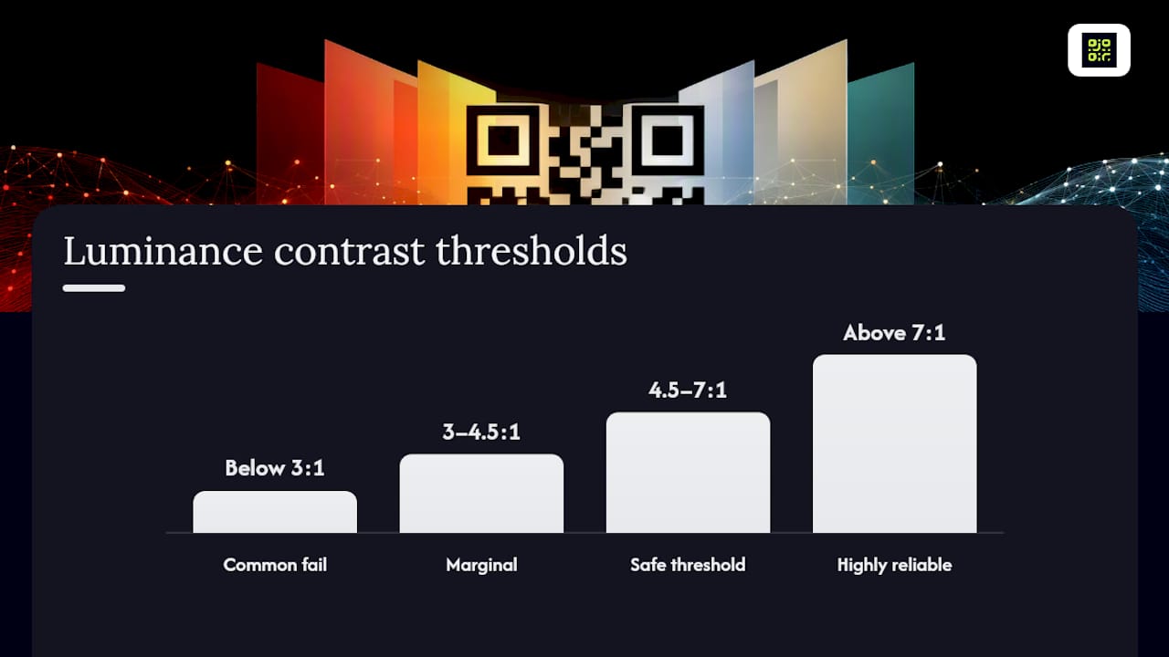
The numbers that matter come from luminance contrast testing on real hex values:
- Below 3:1 — codes commonly fail to scan, especially on cheap cameras or in poor light.
- 3:1 to 4.5:1 — marginal. It might work on a flagship phone in good light and fail everywhere else.
- 4.5:1 and above — a safe working threshold for most printed and digital use.
- Above 7:1 — highly reliable across devices, lighting and print quality.
One practical rule saves a lot of trial and error: keep your foreground modules darker than your background. Dark-on-light consistently outperforms light-on-dark once you factor in real-world lighting, screen glare and printing quirks, even when the contrast ratio on paper looks similar.
Which hex colours actually pass a contrast test?
Guessing at colours wastes print budget. Testing hex values against a white or near-white background gives you a fast, repeatable answer before anything goes near a press.
Here’s how a handful of common brand colours perform against a plain white background, based on measured contrast data:
| Foreground hex | Contrast ratio on white | Verdict |
|---|---|---|
| black | Above 7:1 | Bulletproof |
| #1E3DF5 (brand blue) | 6.2:1 | Safe |
| orange | Below 3:1 | Marginal |
| yellow | Below 3:1 | Fail |
The pattern is obvious once you see it laid out: pure black is unbeatable, strong saturated blues and deep reds tend to sit comfortably in the safe zone, and anything pale, yellow, light pastels, pale greys, collapses fast.
You don’t need to take these figures on faith. Run your own brand colour through a free WCAG contrast checker (many are available online, and most design tools now bundle one in) and compare the result against the thresholds above. If your primary brand colour lands in marginal territory, don’t force it. A common workaround is dropping the brand colour into a border or background element instead of the modules themselves, then keeping the modules near-black. You keep the branding on the page without gambling on the scan.
Do gradients and background panels break QR scanning?
Gradients are one of the most common ways coloured QR codes quietly fail. The reason is simple: a scanner doesn’t average a gradient’s tone. It evaluates the lightest point in that gradient, and if that single point falls below the safe contrast threshold, the whole code becomes unreliable, even though the darker end looked perfectly fine on your monitor.
Test the lightest stop in any gradient, not the midpoint and not the average. If that lightest point clears 4.5:1 against your background, the gradient is safe to use. If it doesn’t, either shorten the gradient’s range or move it outside the actual data area, into a border or frame around the code, so the scannable modules themselves stay a flat, safe colour.
The quiet zone deserves the same scrutiny. ISO/IEC 18004 calls for a clear margin of several modules around the code, and that margin needs to match the colour of your light modules, not clash with it. A coloured background panel that stops short of the quiet zone, or introduces a second colour inside it, can confuse the scanner before it even starts reading data.
Can you recolour finder patterns and add a logo safely?
Finder patterns, the three corner squares, are structurally the most sensitive part of any QR code. Older decoders and budget camera apps rely heavily on strong, consistent contrast in these squares to orient the whole read. Recolouring them individually is workable at large sizes, where each finder pattern can independently meet contrast thresholds, but at small or medium sizes it’s a genuine risk not worth taking.
Logos are safer, provided you respect a coverage limit. Most designers stay under a quarter of the total code area, and a white plate behind the logo (a small blank buffer between the artwork and the surrounding modules) prevents the logo from bleeding into data cells.
Pair any overlay with a higher error-correction level. QR codes support four levels, and moving up from a low level to a higher one gives the code more redundant data to recover from, which is exactly what you need once you start covering part of the surface with branding.
How do you proof coloured QR codes before a full print run?
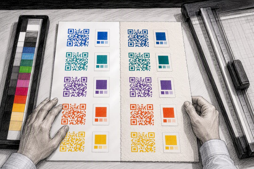
A design that scans perfectly on your laptop screen can fail completely once it hits kraft paper or a glossy laminate. Substrate and finish change how light behaves on the surface, and that changes the effective contrast your scanner sees.
- Check the substrate first. Kraft and recycled stock often have a warm, uneven tone that eats into contrast; compensate with a darker foreground or a printed white backing panel.
- Watch glossy and foil finishes. Specular highlights on shiny surfaces can confuse a scanner’s camera, even when the underlying contrast ratio is fine on paper.
- Convert your proof to greyscale. If the code is still clearly legible in black and white, your colour choice is structurally sound.
- Run a WCAG contrast check on the exact hex values you’re printing, not the values from an early mock-up.
- Get a sample from the actual print run, not just a digital proof or a press proof on different stock. Ink absorption and colour shift vary between machines and substrates.
- Scan it on at least four devices: a current iPhone, a current Android flagship, a budget Android handset, and an older or slightly damaged phone. Budget cameras and worn lenses are where marginal contrast choices get exposed.
Increase the module size for any substrate you’re unsure about. A slightly larger code gives the scanner more pixels to work with, which buys you a bit of forgiveness on tricky paper stock.
How do you build a brand-coloured QR code step by step?
Getting from a brand palette to a printed, working code is a short sequence, provided you do the steps in order rather than designing first and testing last.
- Pick your darkest brand colour for the modules, paired with a background that stays light and clean. If your brand’s darkest tone is still pastel, use it as a frame or sticker colour instead and keep the modules themselves close to black.
- Calculate the contrast ratio using the lightest point in your design (the palest part of any gradient or panel), then convert the whole design to greyscale as a fast visual sanity check.
- Add your logo within safe overlay limits and bump the error-correction level up a notch to cover the extra data loss from the overlay.
- Print a sample from the real run and test it on four phones before you commit to full volume.
Pro Tip: Keep a swatch of your final hex values and contrast ratio saved alongside the artwork file. When a print vendor changes stock or a marketing team reuses the design six months later, you won’t have to re-derive the numbers from scratch.
Impact of ambient lighting conditions on QR code color readability
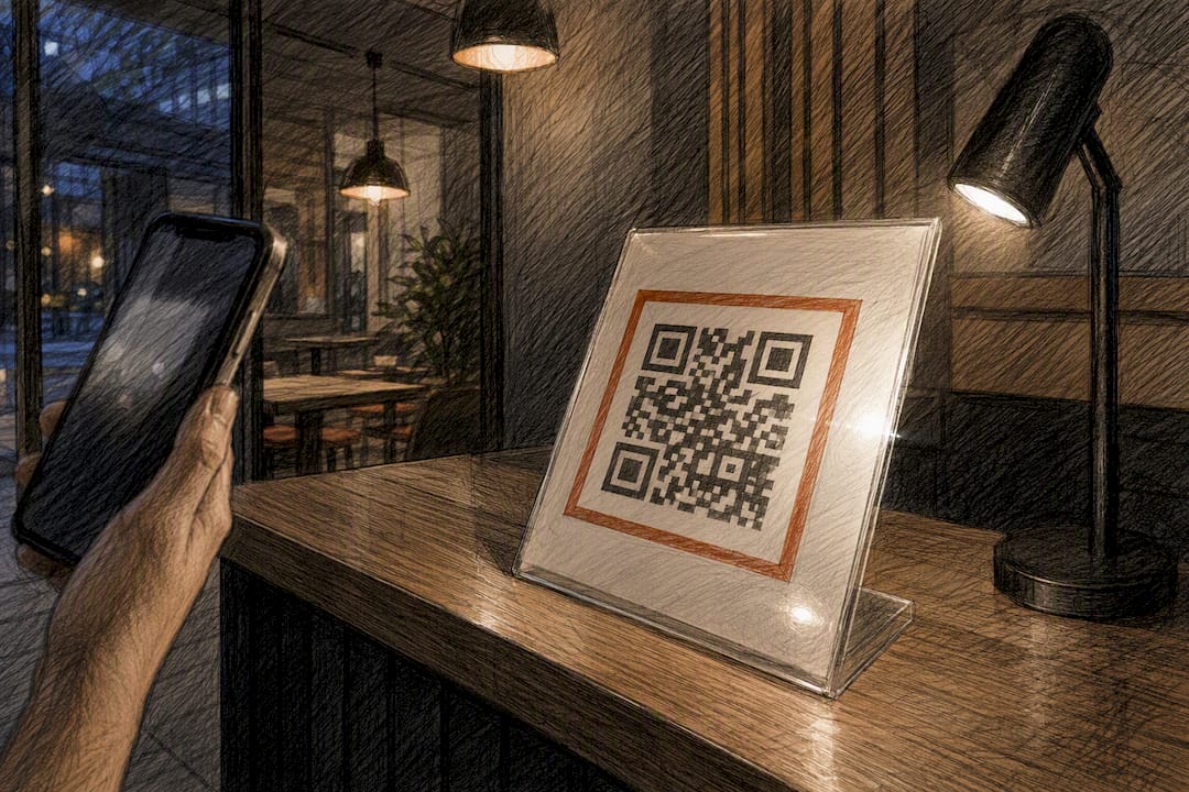
Lighting changes what a camera sees far more than most designers expect. A code that scans instantly under bright office lighting can stall under dim restaurant lighting, direct outdoor sun glare, or the flat fluorescent wash of a warehouse.
Harsh direct light creates hotspots and reflections, particularly on glossy or laminated prints, and those reflections can wash out contrast in exactly the area the scanner needs to read. Low light does the opposite: it drags mid-tones together, so a marginal 3.5:1 ratio that worked fine on your desk can slip below the scanner’s threshold in a dim bar or an underlit lobby.
Outdoor posters and window clings face the widest swing, from bright midday sun to overcast grey to nighttime under artificial lighting, all on the same static print. That’s exactly why the safest colour choices lean toward the higher end of the contrast scale rather than scraping past the minimum. A code sitting at 6:1 or 7:1 has enough headroom to survive a lighting swing that would break a code sitting right at 4.5:1.
If a code will live somewhere with genuinely unpredictable lighting, a shop window, an outdoor sign, a poorly lit event venue, test it under the worst lighting condition you can reasonably expect, not the best. Point a phone at it in a dim room before you approve the final art.
Are coloured QR codes accessible to colour-blind users?
Colour blindness affects a meaningful share of any audience, most commonly red-green colour vision deficiency, and it changes how QR code colours get perceived without necessarily changing whether the code scans.
The good news is that scanning itself doesn’t rely on colour perception. It relies on luminance contrast, the actual brightness difference between foreground and background, which is a separate channel from hue. A red-green colour-blind person and a person with typical colour vision are both looking at the same brightness values when a scanner reads the code, because cameras and decoders never actually process hue at all.
That means a code built correctly for scanning, dark modules against a light background at 4.5:1 or above, is automatically reasonably accessible for colour-blind readers too. The risk shows up in a different place: when a design relies on two colours that are visually distinct to someone with typical vision but nearly identical in brightness or hue to someone who isn’t, such as certain red and green combinations. If a design uses colour to convey extra meaning around the code (an instruction, a warning, a call-to-action badge) rather than in the code itself, pair that colour with text or an icon so the message doesn’t depend on colour perception alone.
Why do QR colours look different on screen than in print?
A colour that looks perfect on a laptop display can shift noticeably once it comes off a printer, and that gap catches out a lot of otherwise careful design work.
Screens use RGB (red, green, blue) light emission to produce colour, while most commercial printing uses CMYK (cyan, magenta, yellow, black) ink. The two systems don’t cover the same range of possible colours, so certain screen colours, particularly saturated blues, bright greens and neon shades, simply cannot be reproduced exactly in CMYK. The printed version usually comes out slightly duller or shifted in hue.
That shift matters for contrast, not just aesthetics. A brand blue that measures 6.2:1 contrast on your monitor might print marginally darker or lighter depending on the printer’s calibration, the ink density, and the paper’s own base colour. Uncoated or recycled stock, in particular, tends to absorb more ink and mute the result.
The fix isn’t complicated: never approve a coloured QR code based on a screen preview alone. Pull a physical proof, ideally from the actual printer and stock you’ll use for the full run, and re-run your contrast check against that printed sample rather than the digital mock-up. If you’re printing across multiple vendors or substrates for one campaign, spot-check a proof from each one; colour consistency between print shops is far from guaranteed.
What advanced colour techniques work for branded QR codes?
Beyond a flat foreground and background, a few more advanced techniques let brands push further without sacrificing scan reliability, provided each one respects the same contrast rules covered earlier.
Duotone modules, where the QR pattern uses two brand colours instead of one flat colour, can work if both colours independently clear the safe contrast threshold against the background. Treat each colour as its own contrast test rather than assuming the pair averages out safely.
Custom module shapes, rounded dots, or subtly rounded corners instead of square pixels, are widely supported by modern generators and don’t affect scanning provided the shapes don’t shrink the effective dark area of each module. Extremely decorative or thin module styles can reduce the printed dark area enough to tip a marginal contrast ratio into failure.
Frame and call-to-action badges around the code (a “Scan me” banner, a border in brand colour) are one of the safest ways to inject strong branding, because they sit entirely outside the data area and the quiet zone. This is often the best answer for brands whose palette is naturally light or pastel: keep the scannable core in high-contrast dark-on-light, and let the frame carry the brand colour.
Layered colour on finder patterns, applied only at large sizes with each pattern independently tested, can work for hero placements like posters or vehicle wraps, but it’s not a technique to default to for small-format packaging or business cards.
Which colour combinations should you avoid entirely?
Some combinations fail often enough that they’re worth ruling out before you even reach for a contrast checker.
Yellow-on-white is the classic failure: it looks bright and cheerful on screen, and it scores close to 1:1 contrast, meaning it’s barely distinguishable from the background at all. Light pastels on white behave similarly, pale pink, pale blue, pale mint, all sit in fail territory even before you factor in print variation or dim lighting.
Mid-tone colour pairs cause the second most common failure, particularly when a designer picks two brand colours that look distinct to the eye but sit close together in actual brightness, a mid-grey foreground on a beige background, for instance, or a muted teal on a warm cream. These combinations often pass a casual glance and fail a real scanner.
Metallic or foil colours on foil backgrounds are worth flagging separately: beyond the contrast issue, foil surfaces create specular reflection that can confuse a camera regardless of the underlying colour values. And light-on-dark inversions, white or pale modules on a coloured background, tend to be less forgiving in mixed lighting than the equivalent dark-on-light version, even at matching contrast ratios, simply because scanners and decoders have been tuned against decades of dark-on-light real-world codes.
Brand fidelity or guaranteed scanning: which wins?
There isn’t a single right answer here, and treating it as one usually leads to bad decisions. Large-format applications, event banners, vehicle wraps, poster campaigns, can absorb a bolder branding treatment because the code itself is big enough to carry extra contrast headroom even with stylistic touches. Small-format touchpoints, business cards, product packaging, receipts, have no such margin. Contrast has to win there, every time.
The hybrid approach solves most of the tension: keep the scannable core in dark modules on a light background, then wrap it in a branded frame, sticker, or border that carries your palette. It’s how you get a code that still reads as yours without gambling on a scan. For campaigns that need to survive changes after printing, a dynamic code that lets you update the destination later gives you room to fix a mistake without reprinting the whole run.
— The
Create tested, brand-coloured QR codes with QRlytics
Qrlytics gives you a faster way to move from “will this colour scan?” to a confirmed, working code, without reprinting a batch to find out the hard way. The generator shows a live colour preview as you build the code, so you can check how a brand palette actually looks before committing to a design.
A few features solve the exact problems covered in this guide:
- Colour preview before export, so you can eyeball contrast issues early rather than after printing.
- Codes that stay permanent once created during an active subscription, regardless of billing status, so a campaign never dies quietly because a free tool deactivated it.
- Real-time scan analytics and heatmaps, so you can confirm a coloured code is actually performing once it’s live, not just guessing from a desk test.
- Dynamic destination updates, meaning a printed batch survives even if the landing page changes later.
If you’re preparing a printed campaign, start with a free QR code using your chosen brand colours, run it through the contrast and multi-device checks covered above, and confirm it scans cleanly on your own substrate before you commit to a full print run.
Sources
FAQ
What colour should QR codes be?
Dark modules on a light background give the most reliable results, ideally black or a deep saturated brand colour on white or near-white, with contrast measuring 4.5:1 or higher.
How do you colour your QR code?
Choose your darkest brand colour for the modules, check its contrast ratio against your background using a WCAG contrast tool, then convert the design to greyscale as a final visual check before printing.
Can a QR code be any colour?
Technically yes, but practically no: any colour combination that fails to hit at least 3:1 luminance contrast risks scan failures, and anything below 4.5:1 should be treated as unreliable for real-world use.
Are coloured QR codes effective?
Coloured codes scan just as reliably as black-and-white ones when the contrast ratio clears the safe threshold, and a well-tested brand colour can improve recognition and click-through without costing you scan reliability.
Do gradients ever work in a QR code?
Only if the lightest point in the gradient still meets the contrast threshold on its own; the scanner judges the weakest point, not the average tone across the design.